CurologySocial Ad Templates
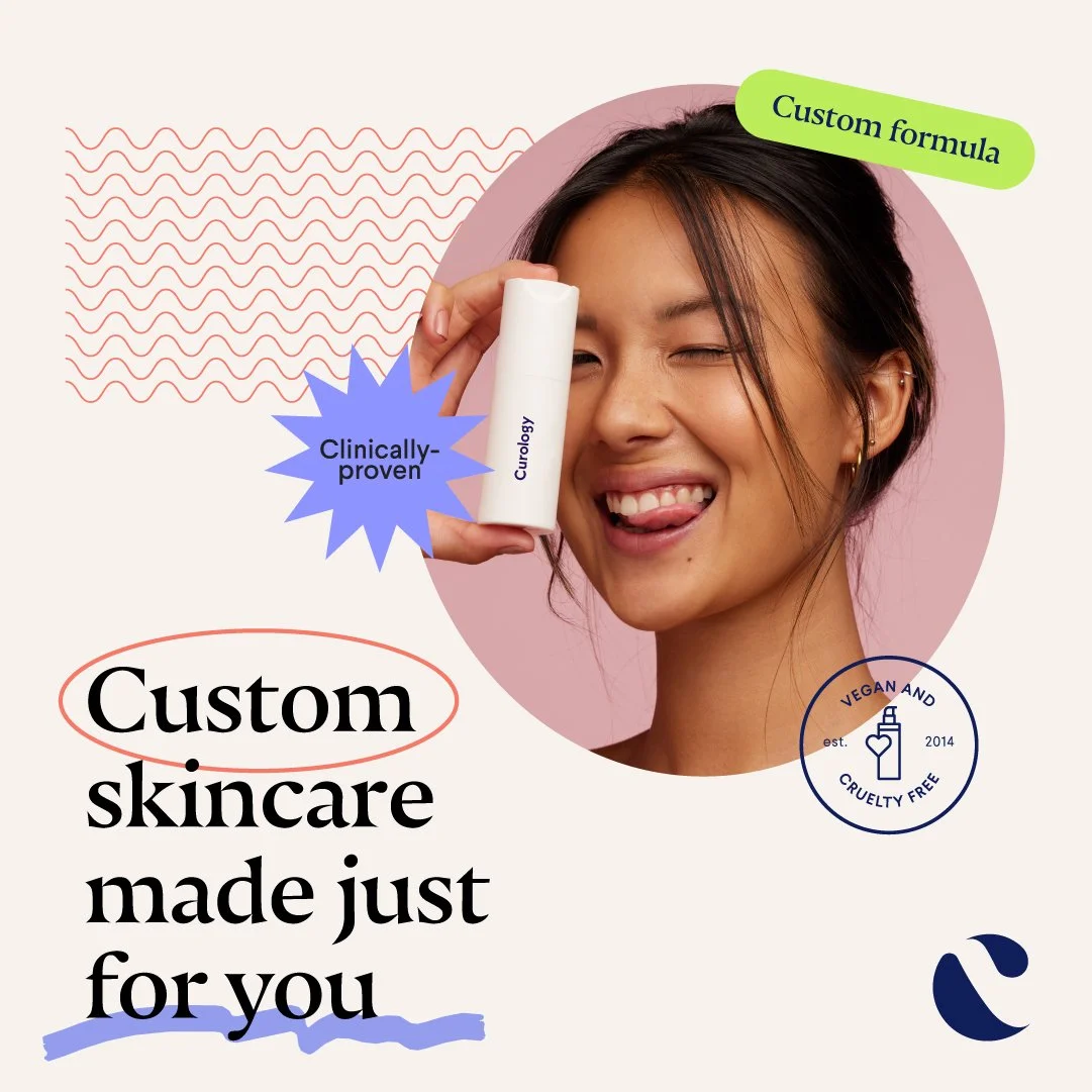
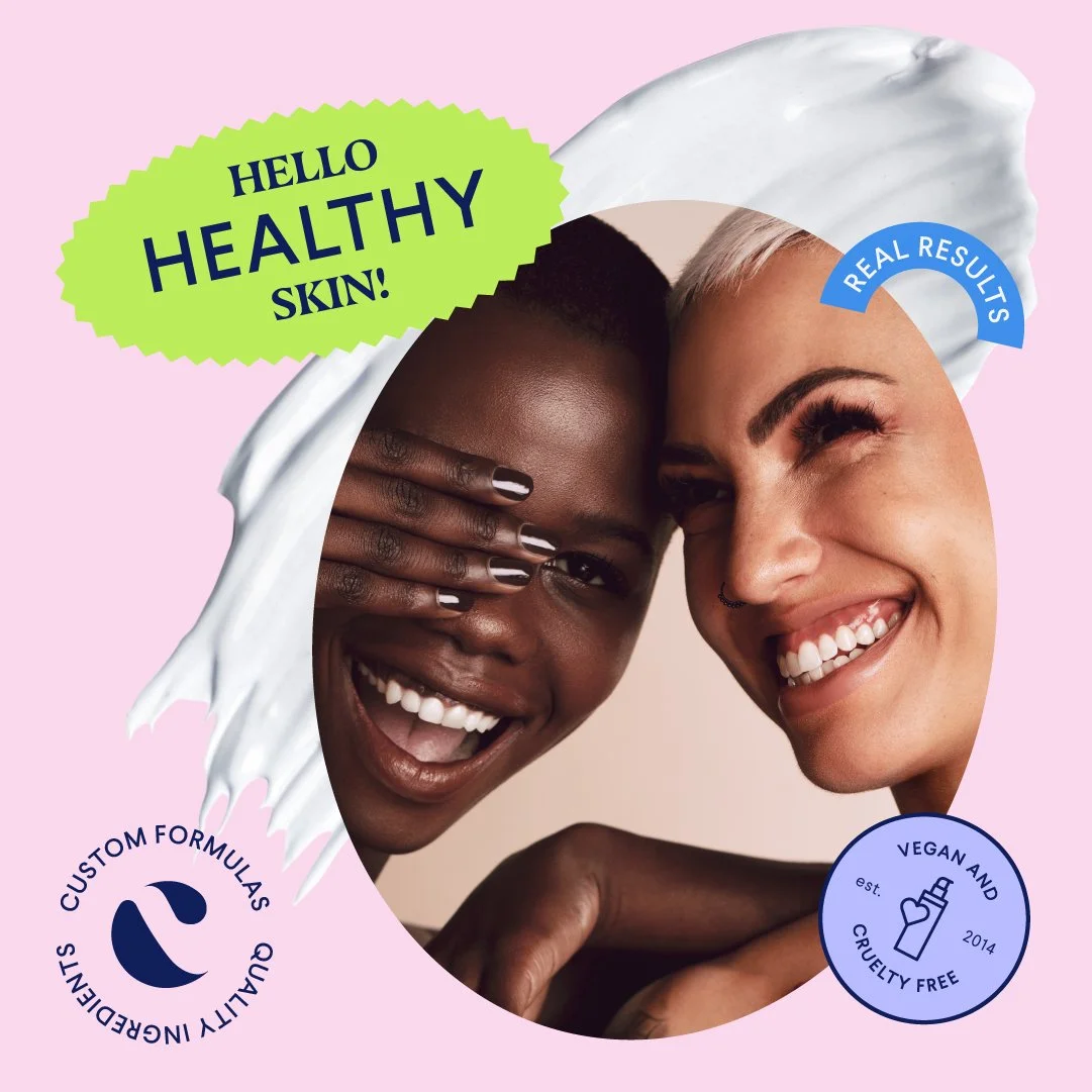
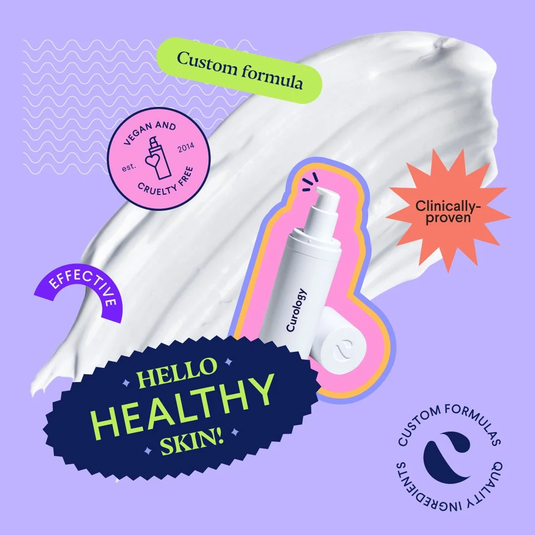
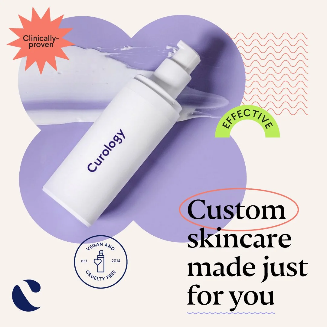
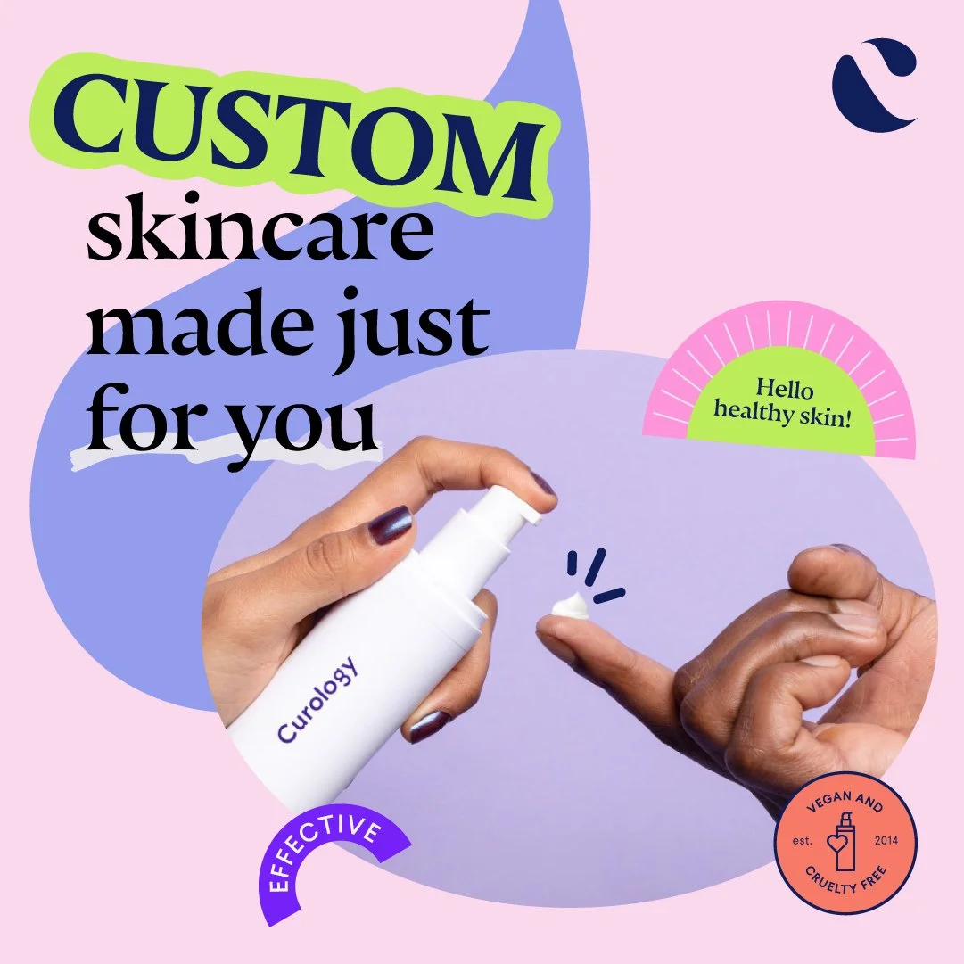
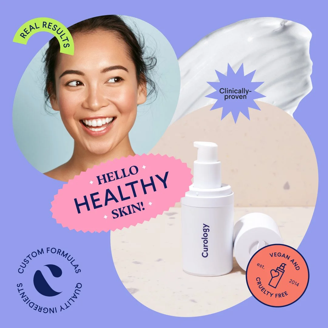
Curology — the custom skincare brand built around personalized formulas — came in with an unusually generous brief: a fresh approach to presenting their hero product across Facebook News Feed ads, and explicit permission to push brand boundaries and have fun with it. The audience was women 18–40 with general skincare concerns. The primary metric, in Curology's own words: "how many people internally say 'oh!'" The goal wasn't conversion. It was making something that broke the scroll.
Role: Graphic design direction, in collaboration with the Superside team.
Credits: Direction — Bianca Pieterse (Concept Art), Joshua Roscoe (Copy), Anoosh Babayan (Graphic Design). Creative — Amanda Raath. Produced with the Superside team.
What I did: Led the graphic design direction across the project. Took Curology's existing brand palette — lavender, navy, tan — and pushed it into something louder: bright pinks, electric greens, hand-drawn shapes, mixed-typography compositions, badges and stickers built to feel cut-and-pasted rather than placed. Held the work to brand recognition (logo presence, product hero placement) while letting every other element flex hard. Shipped 6–8 distinct templates, each treating the same hero product as a different visual statement.
The challenge: Beauty brands tend to play it safe — clean, minimal, the same lavender-and-cream palette every other custom skincare brand uses. Curology's brief was an explicit invitation to break that pattern, but breaking it without losing the brand is the harder version of the job. Every template had to feel unmistakably Curology and unmistakably bolder than what Curology had been doing. The work needed to land the "oh!" reaction without leaving the audience asking whose ad they just saw.